IAG TECH: BRITISH AIRWAYS
International Airlines Group (IAG), one of the world’s leading airline groups and owner of some of the biggest aviation brands, such as British Airways. IAG is in the process of improving it internal Apps specifically used by airport ground staff and cabin crew.
Company
British Airways
Year
2022
Role
Lead UX/UI Designer
Product
App Authentication
THE CHALLENGE
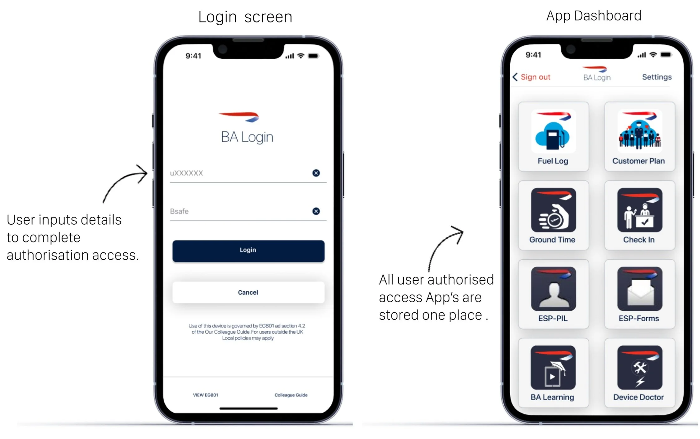
The BA Login App serves as the gateway for staff authentication, granting them access to a range of essential internal applications crucial for the daily operations of ground staff and cabin crew. Originally, this application operated on an outdated framework (Objective-C) but has since undergone a transfer to SWIFT (Xcode). As significant updates have been implemented on the backend, this presented an opportunity to modernise the UI and enhance the overall user experience on various mobile devices.
Old design
PROCESS
DISCOVERY
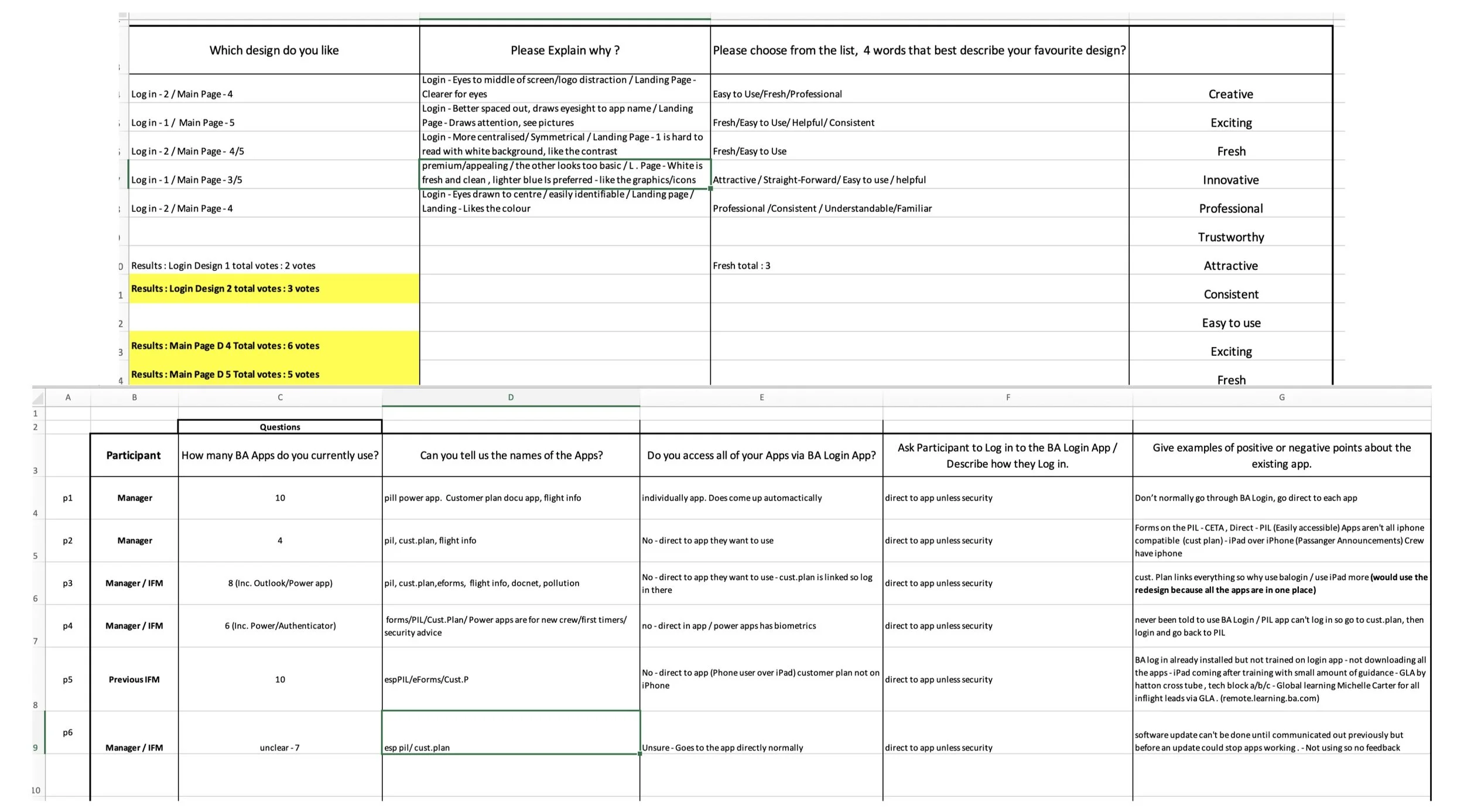
I conducted interviews and a questionnaire with the main users, the cabin & flight crew. To understand how they use the APP to day and to get further insights. Our findings were collated on a team confluence page.
UI DESIGN FEEDBACK QUESTIONNAIRES
The research highlights revealed a notable deficiency in providing new staff with proper education during their onboarding process regarding the app's functionality and its advantages. Upon taking the time to engage with users and enlighten them about the fundamental principles of the app's original design, they began to recognise the value it brought, particularly in the accessibility of other daily-use apps.
Maintaining the black colour scheme was of significant importance to the flight crew, (pilots). This choice was based on its suitability for use in the flight deck during nighttime operations, as it aligns with aviation regulations that stipulate specific human factor requirements for apps used in the flight deck environment.
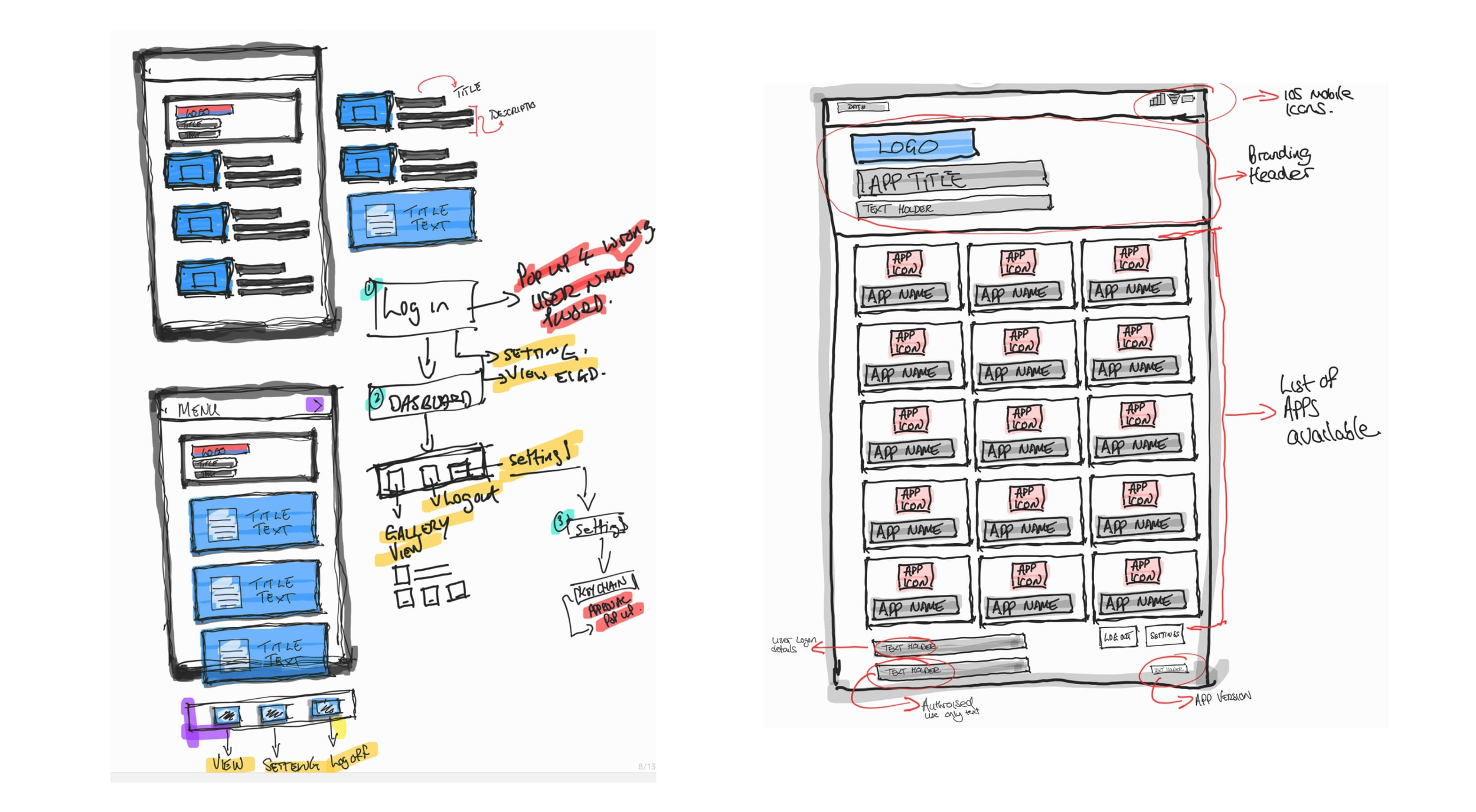
SKETCHING
LOW FIDELITY SKETCHING
In order to quickly explore alternative layouts with the team, I used a low fidelity for the initial sketches that intentionally omit a lot of detail, other than the main elements and blocks of content.
HIGH FIDELITY SKETCHING
As layouts were gradually agreed upon with users and stakeholders, the fidelity of the UX outputs (in this case, sketches) were increased to introduce more detail into our discussions.
WIREFRAMING
LOW FIDELITY WIREFRAMING
With a similar goal to the low fidelity sketches, lo-fi wireframes were explored to ensure the desired layouts worked well with the company/brand and platform guidelines e.g. layout grids and recommended components for the given use cases.
UI DESIGN
FINAL DESIGN
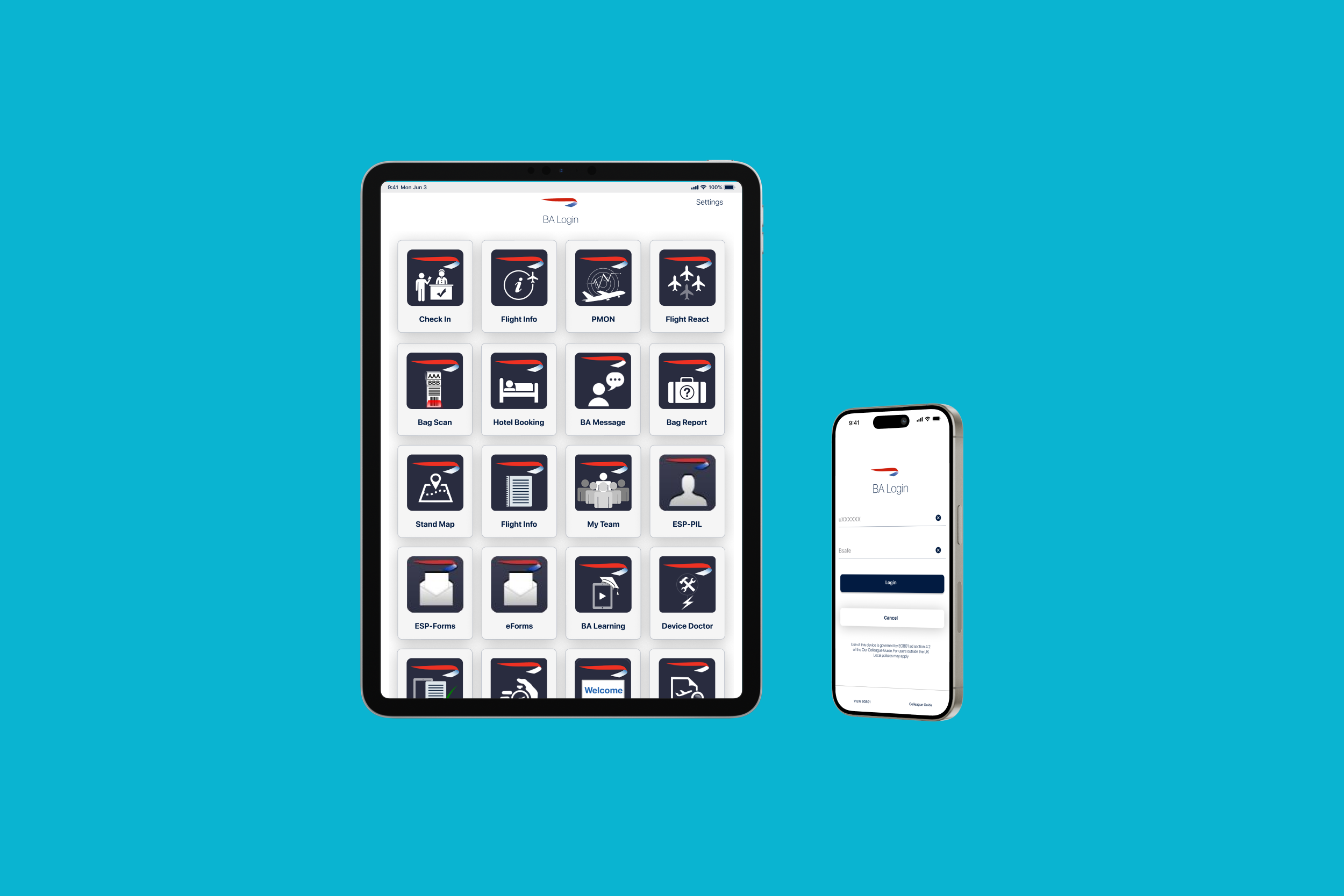
For the final design, we were required to used the existing App icons as we didn’t have internal approval for the resdesign, and the time required to complete this requirement exceed the sprint schedule.
iPad design
iPhone design
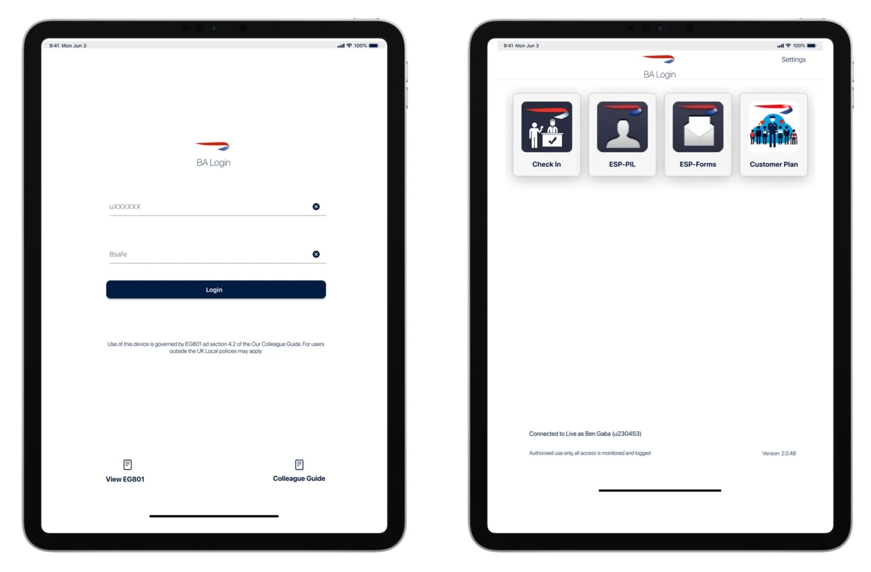
PROTOTYPING
iPad prototype design
iPhone Prototype design
